This summer, we got the kind of phone call that designers dream of.
The Birmingham Barons were on the line. And they wanted us to design a new alternate jersey for our hometown team.
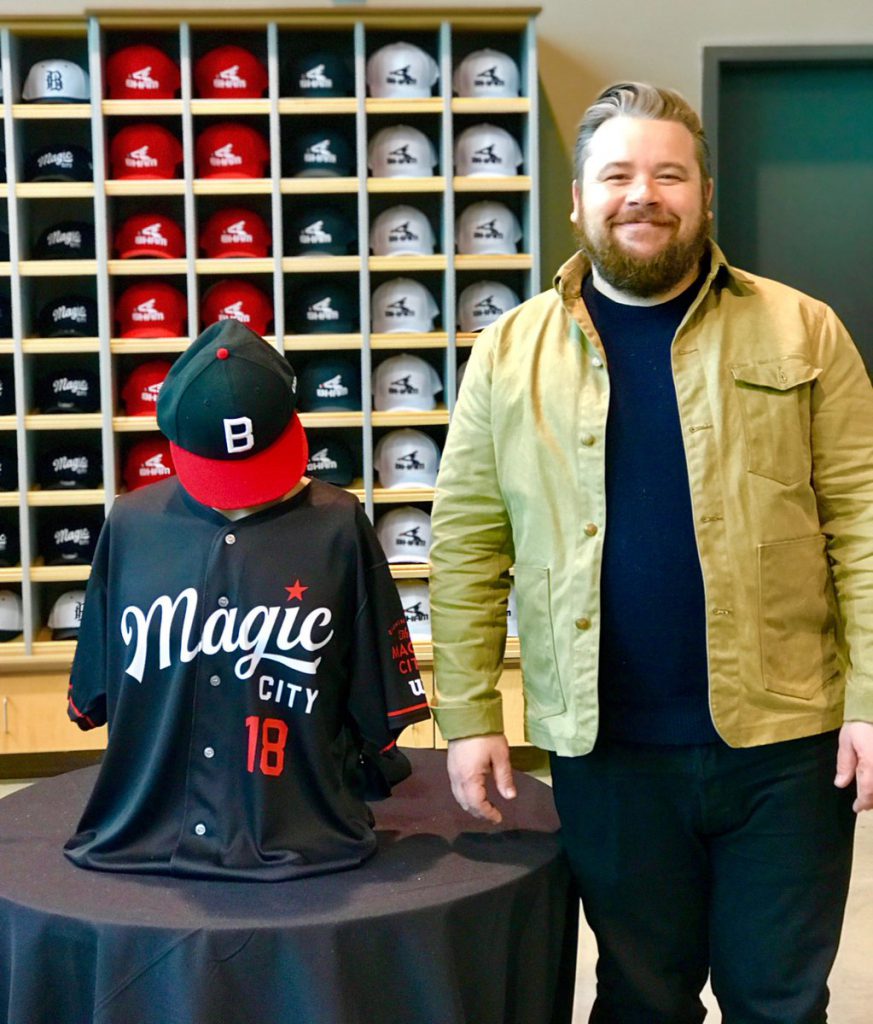
“They were looking for a city-centric, alternate jersey,” said associate creative director Matt Lane Harris, who led the charge on the jersey design. “So they came to us, wanting us to design it. We’re season ticket holders and all. So we jumped at the opportunity.”
As we found out, Minor League Baseball is doing a league-wide push for city-centric jerseys to be worn during the 2018 season (and beyond, we hope). And given that the Birmingham Barons have one of the richest baseball histories in all of the minor (or major) leagues—dating back more than 130 years—there was plenty of inspiration to draw from.

Associate Creative Director Matt Lane Harris and his Magic City jersey design.
“We cast a wide net at the beginning,” said Harris. “We wanted it to have a historical reference to it, so we looked at some old jerseys. We whittled it down and landed on the design we did. They liked the ‘Magic City’ logo, and the hat was an homage to the Birmingham Black Barons.”
We had a field day (pun intended) with this project, and once it was all said and done, it felt like…okay, we have to say it—it felt like a home run. (Sorry.)
“We’re thrilled with how they turned out,” said Harris. “Simple and old school, without a lot of embellishment.”
Harris’s design was unveiled yesterday during an event at Regions Field. It was a great way to end the year for us here at Big and a future highlight for 2018. It was made even more special as we watched the social media world react with glee throughout the afternoon and into the evening.
And you’d better believe we’ll be out there for Opening Day next season. We might even have to buy a few of those jerseys for ourselves.